Where the Pros Go
Since 1996, chefs around the world have relied on SOS Chefs to bring exotic and uncommon spices to their kitchen. They have thrived on bringing the first, and best of what is available from the bounty of the world. Their motto “where the pros go” is quite literal: their storefront is a revolving door of the cities most renowned chefs, and special orders for high-end, one of a kind dishes are a daily occurence.
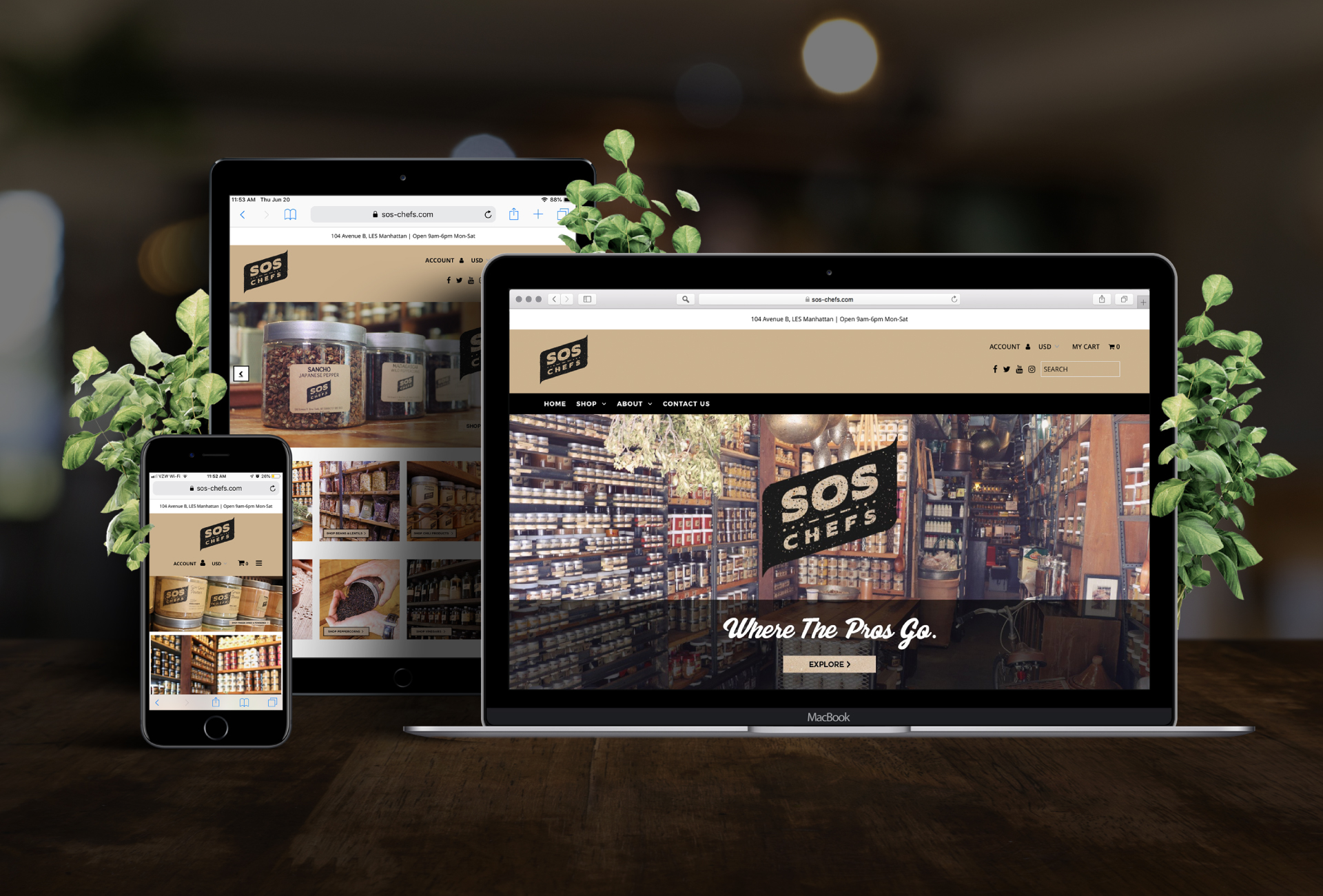
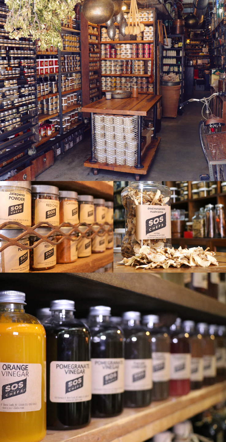
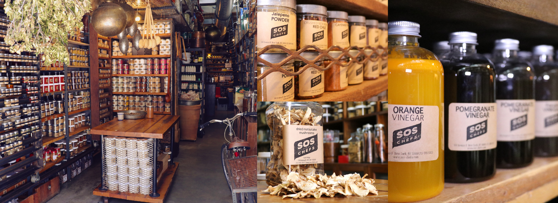
SOS Chefs has been a Manhattan institution for decades, but despite their store being frequented by the most well known chefs in the city, their online presence needed a refresh. Our goals with this project were twofold: to seamlessly switch the SOS Chefs online store to the Shopify platform, and to instill customer confidence with a modern and attractive look. We leveraged photos from an in-house photoshoot of their unique store, and created a satisfying and on-brand user experience to complete a cohesive website that has led to a huge increase in the business’ online sales.
BRAND STRATEGY
BRAND IDENTITY
PACKAGING DESIGN
WEBSITE DEVELOPMENT
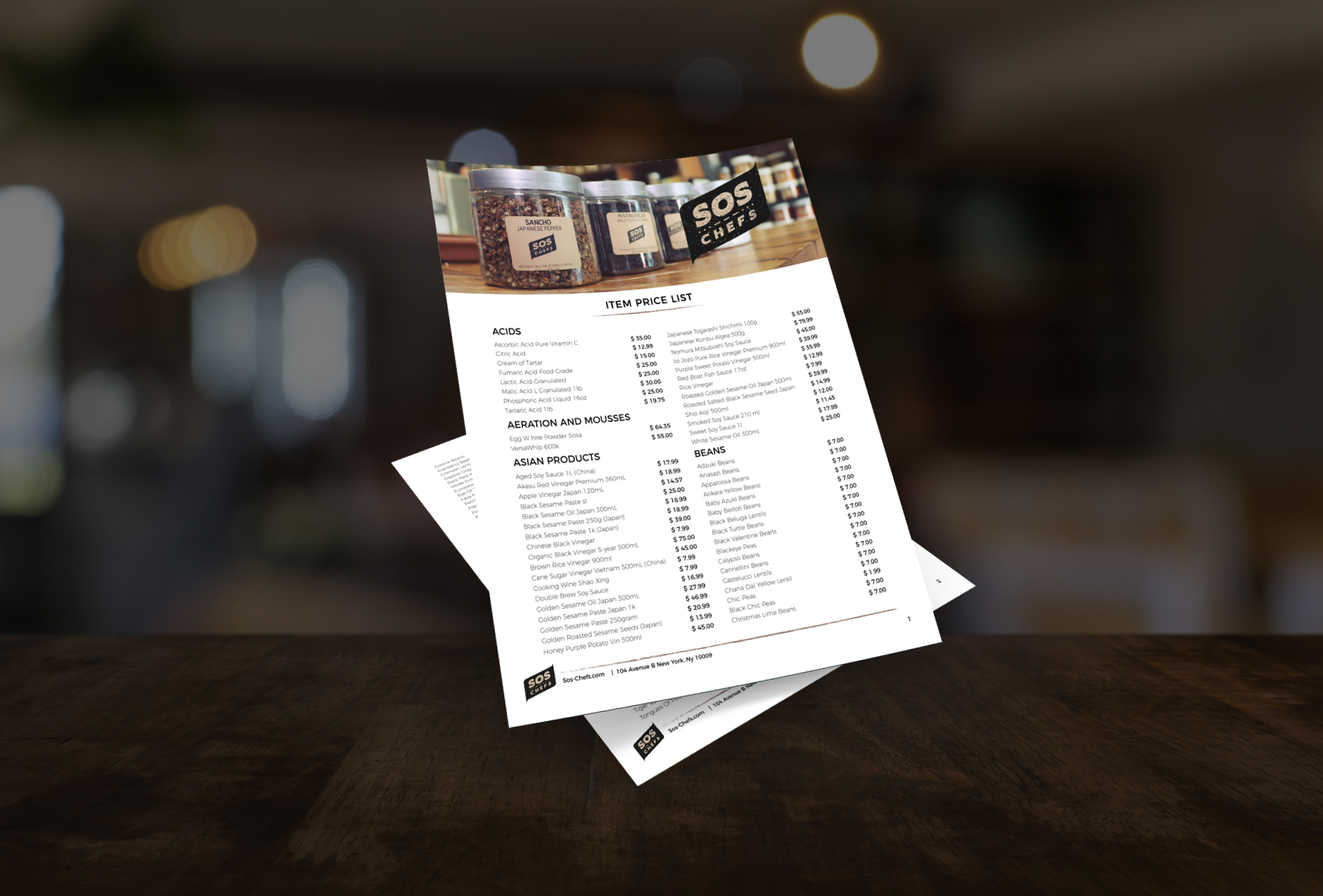
PRINT DESIGN
DIGITAL AND SOCIAL DESIGN