Groceries Check
Groceries check was created to provide an easy to use service with which users could have groceries not only delivered, but also put away in their homes or vacation rentals. To appeal to the wide range of users from the elderly to vacationing college students, we went with an instantly recognizable grocery cart and a soft lowercase font with a lush green for the check mark and text. Groceries Check has grown to be Myrtle Beach’s premier food delivery service. We went with an unmistakably recognizable grocery cart and a soft lowercase font with a fresh green accent for the check mark and text.
BRAND IDENTITY
BRAND STRATEGY
ART DIRECTION
BRAND STRATEGY
ART DIRECTION
ANIMATION
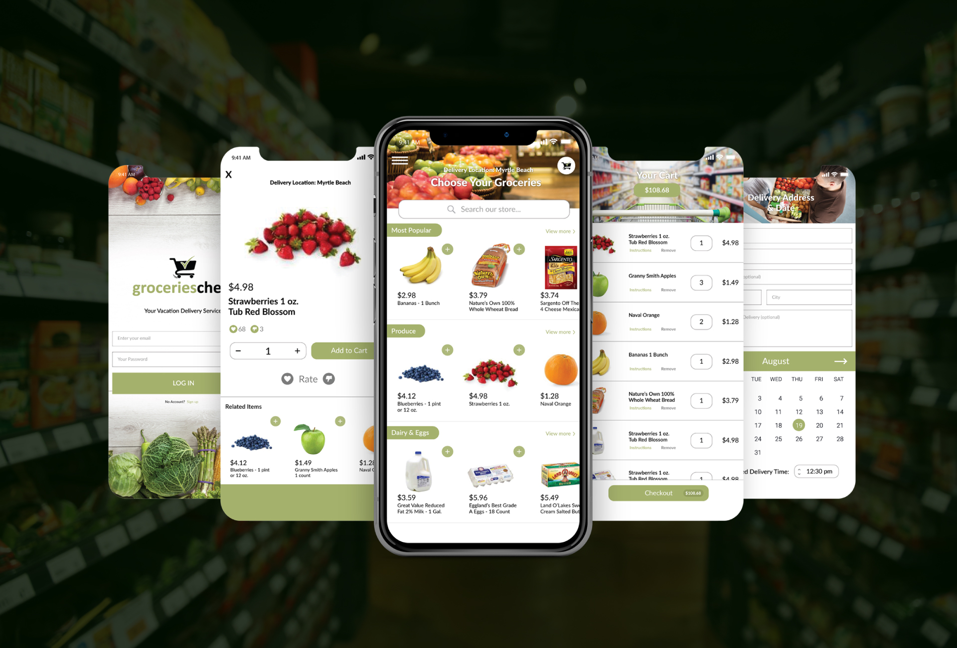
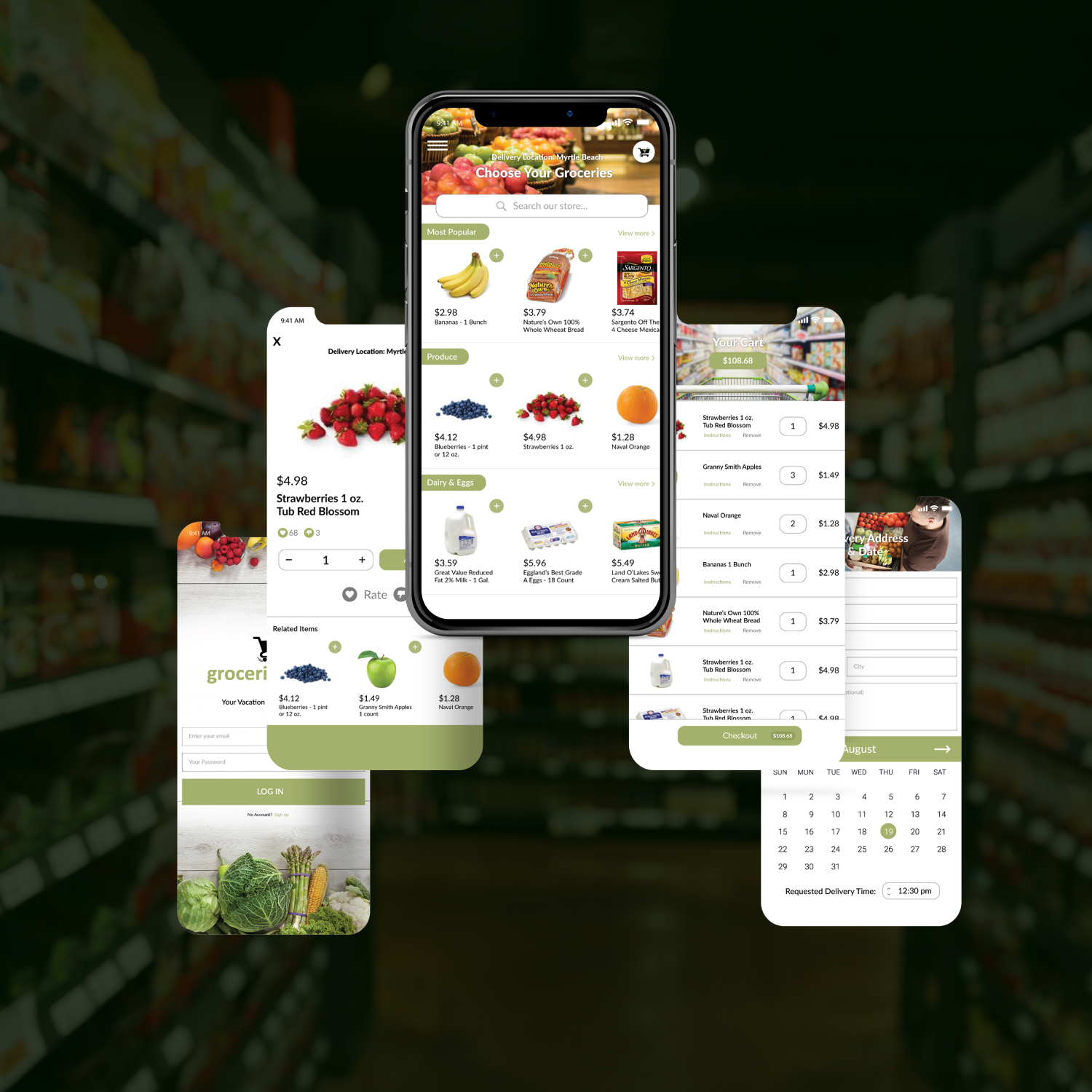
USER INTERFACE DESIGN
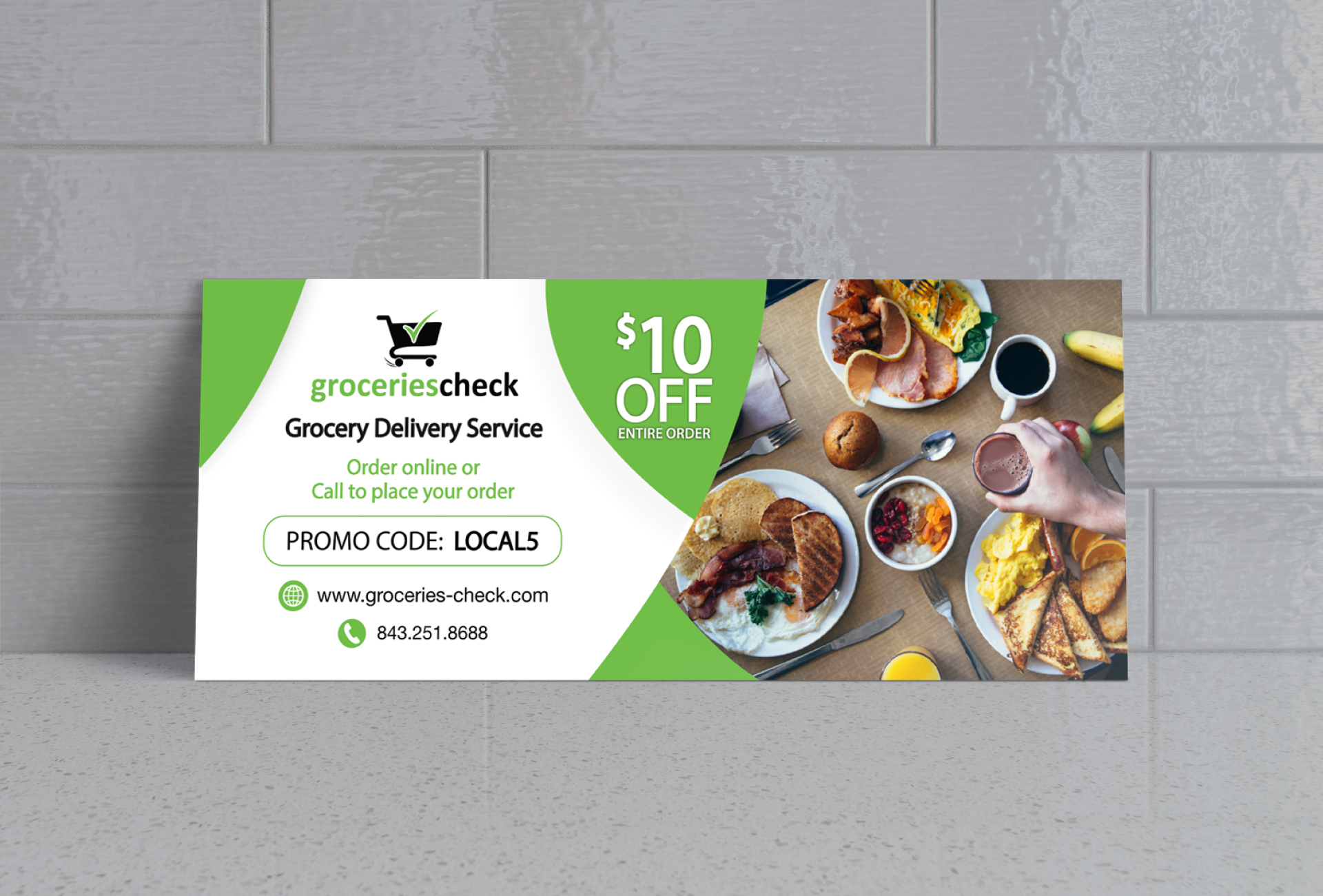
PRINT DESIGN
USER INTERFACE DESIGN
PRINT DESIGN


Your Vacation Delivery
After 12 months in business, Groceries Check had grown enough to execute on their mobile application. We were tasked with designing the face of it. Once we thought through the user's process, we began to design the initial proofs of all of the app’s screens. It was a matter of creating a intuitive, clean interface to inspire confidence in users, increase first time conversion rates, and boost net use of the service. In short, we made it as simple and as user friendly as possible to find the groceries you need, add them to your cart, and pick your delivery date.
Customer Relatability
The purpose of this animated video was to concisely explain how the service works, and the value proposition to the three main buyer personas: the elderly, busy families, and vacationers. The playful artistic style helps palatably convey the ease and convenience of the service and was chosen to appeal to the widest audience.